
 | Rodney Davidson DOGSTAR Design |
My visit to the library last Saturday yielded some great books on design. While peering through numerous examples of branding, I came across the image above and thought it genius. Can you see the C and the A that stand for Cigar Aficionado? And yet, it's just a guy with a hat on, puffing away on his cigar. I love the simplicity of it. Clean, simple, clear design. I often strive for this but usually don't hit it on the mark as well as this does. DOGSTAR has some other great examples of design on their site. Like this one for a walk in clinic:

| Rodney Davidson DOGSTAR Design |
This one is amazingly subtle. Walk in. Okay, I get it, there are footprints. But look closer... do you see the "plus" sign in the middle that often stands for "hospital." That's the clinic part. I love how he used the negative space to convey the rest of the meaning. Brilliant!
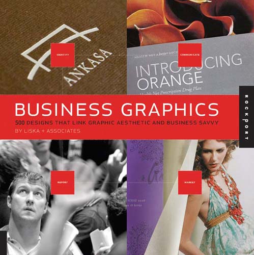
Ironically enough, I went from reading through this book: "Business Graphics: 500 Designs That Link Graphic Aesthetic and Business Savvy"
to this posting by a friend this morning entitled, "Is Advertising Art?" What an interesting question to ponder. Especially in light of the fact that I'm trying to get ideas for a new brochure design for a client. And while of course I'd like to think of my work as "art" it also has a distinct purpose which is to "sell." In this specific case it's selling a service, hospice care, but it's still consumer based. It's not ars gratia artis (art for art's sake). It's trying to get something done, convey a message, invoke an action (in this instance hopefully choosing to go with this hospice over another). Is that art? I'm really not quite sure. It's hardly on the same lines as a Caravaggio painting or a Brancusi sculpture. But the most successful designs (or branding) make use of aesthetic elements in the best way, just like a good painting does. So maybe in the end they are based on the same set of "rules" but have a different purpose or intent.
Whew! That's enough deep thought for 8 in the morning. Thanks for letting me hash that out a bit with you. Now it is off to start my day!
3 comments:
FYI - there's an interesting logo on branding by the Media Education Foundation called "No Logo." You might find their stance thought-provoking. (This is the same group that I got the 5 Key Questions from that I posted with the video clips).
http://www.mediaed.org/cgi-bin/commerce.cgi?preadd=action&key=115
Ohhh... just watched the clip. Fascinating. Might need to check out the book. Thanks for sharing!
Learn something every day. Thanks for a great post.
Post a Comment