Showing posts with label design work. Show all posts

Sunday, August 21

| in the "studio"

My "studio" currently consists of shoving everything off the dining table and spreading art supplies across it. Here's a glimpse of what went on this weekend at the table.

{At the table... hmmm, I kind of like that as a shop name or a design house. At the table. I'm going to have to remember that one.}


I'll show you the final product(s) next week after the favors have all been gifted.

Thursday, June 4

packaging

It's all about the presentation, at least that's what my mom used to say. I'm pretty sure she can gift wrap like no one else. If there was a gift wrapping competition she could do it with about three pieces of tape and perfectly folded corners. She could make a little 5 dollar gift look like it was meant for a queen. Seriously. It wasn't til I got to college that I realized that this phrase really rings true in design work. You could have a marvelous project, but if it's not displayed well, it detracts from the work. On the other hand, a good photograph can become great when it's framed in such a way to compliment it.(Don't get me started on the process of choosing matting and frames... I feel like I'm making a commitment akin to marriage every time I try to pick)

So without further ado, I present to you TheDieline.com. I found it last week as I was scouring for design blogs and sites to peruse on a daily basis. Boy am I happy I did. I have been known (on more than one occasion) to buy something merely because I am drawn to the packaging, doesn't even matter what's inside. I see the box, the jar, the lid, the bag, whatever it is, and I must get it. M, being the wonderful man that he is, has picked up on this and at times has even been able to say, "You just like what it comes in, don't you?" To which I gaze up at him with that grin that says, "I really MUST have this." The Dieline site is pages and pages of things like that. Let me show you a few:

Yael Miller of Miller Creative

Designed by Asprey Creative
Hattomonkey, a Russian design firm
enormouschampion Kingdom Animalia

Tuesday, May 5

marker love

This weekend I purchased a package of 24 fresh, new, ultra fine point sharpie markers in various colors. Such a simple indulgence has made my note taking for work all the more exciting. And so, with my love of colored sharpies renewed, I present to you this little tribute.

Thursday, March 5

featuring : dogstardesign

| Rodney Davidson DOGSTAR Design |


My visit to the library last Saturday yielded some great books on design. While peering through numerous examples of branding, I came across the image above and thought it genius. Can you see the C and the A that stand for Cigar Aficionado? And yet, it's just a guy with a hat on, puffing away on his cigar. I love the simplicity of it. Clean, simple, clear design. I often strive for this but usually don't hit it on the mark as well as this does. DOGSTAR has some other great examples of design on their site. Like this one for a walk in clinic:

| Rodney Davidson DOGSTAR Design |


This one is amazingly subtle. Walk in. Okay, I get it, there are footprints. But look closer... do you see the "plus" sign in the middle that often stands for "hospital." That's the clinic part. I love how he used the negative space to convey the rest of the meaning. Brilliant!

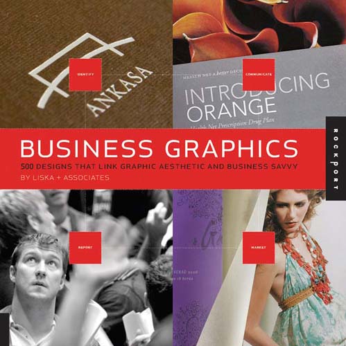
Ironically enough, I went from reading through this book: "Business Graphics: 500 Designs That Link Graphic Aesthetic and Business Savvy"


to this posting by a friend this morning entitled, "Is Advertising Art?" What an interesting question to ponder. Especially in light of the fact that I'm trying to get ideas for a new brochure design for a client. And while of course I'd like to think of my work as "art" it also has a distinct purpose which is to "sell." In this specific case it's selling a service, hospice care, but it's still consumer based. It's not ars gratia artis (art for art's sake). It's trying to get something done, convey a message, invoke an action (in this instance hopefully choosing to go with this hospice over another). Is that art? I'm really not quite sure. It's hardly on the same lines as a Caravaggio painting or a Brancusi sculpture. But the most successful designs (or branding) make use of aesthetic elements in the best way, just like a good painting does. So maybe in the end they are based on the same set of "rules" but have a different purpose or intent.

Whew! That's enough deep thought for 8 in the morning. Thanks for letting me hash that out a bit with you. Now it is off to start my day!

Monday, February 23

it's the start of something, i can feel it

Rumblings. I feel rumblings. Good ones.

I was recently blessed with a few extra hours in my day and because of that decided to start reading "The Artist's Way" by Julia Cameron. This was one of the many books I bought in college because it was on the syllabus, but never got around to actually reading. Now, nearly 7 years later, I've picked up with every intention of following through this time.


This morning was my first stab at it. It's basically a 12 week course on "discovering and recovering your creative self." Yes, I know, it sounds a bit hokey. But it's really not. There's a reading for each week, a daily writing assignment as well as a weekly tasks and a required "artist date." Four months of trying to figure out where my creativity went, how to get it back and how to nurture it.

The reading this morning for the week was about "shadow artists." The idea that so many people who truly have the ability to be artists, lack the confidence to actually realize that and so become shadow artists, "unable to recognize that they themselves may possess the creativity they so admire... shadow artists often choose shadow careers - those close to the desired art, even parallel to it, but not the art itself." {pg 27}

Many of the weeks activities at the end of the chapter relate to identifying negative beliefs about yourself and your art and turning them into affirmative statements. I like to think of myself as pretty confident, but when I really started to think about myself in relation to my art I realized that I have a very difficult time coming up with positive thoughts. I'm usually critical of my own work and tend to undermine it without even realizing that's what I'm doing. Even the compliments I do get, I invalidate by saying, "Well, they're not a trained eye. They don't really know what they're looking at. They would think anything looked good. If they knew what they were talking about they would realize this is crappy work." Okay, maybe I DO have somethings I need to fix about my thinking.

So I walked away from this morning's little study session ruminating on these quotes:

"Creative recovery is like marathon training (hey! something I CAN do). We want to be great - immediately great - but that is not how recovery works. It is an awkward, tentative, even embarrassing process. There will be many times when we won't look good - to ourselves or to anyone else. We need to stop demanding that we do (what? I don't do that... noooo). It is impossible to get better and look good at the same time (whoaaa... revelation)." {pg 29}

"Give yourself permission to be a beginner." (this is hard for me. i want it to be perfect right off the bat) {pg 30}

"To live a creative life, we must lose our fear of being wrong." ~Joseph Chilton Pearce

Saturday, February 14

a very happy saint valentine's to you

We're having a wonderfully relaxing day around here. After being inspired by a belated birthday gift {from a dear friend} I played around with my camera a bit this morning...


and with Lightroom and Photoshop. | Original photographic credits go to Anthropologie |

Tuesday, January 20

inauguration day

In honor of the swearing in of our new President, I thought I'd take a moment to point out that the logo for Obama's campaign was a great design. It's clean, clear, simple. It's not as vague as Pepsi's "new" logo. It combines the American flag with the idea of hope on the horizon in a smooth and comprehensive way. Just see for yourself. Good design. Let's hope the next four years are just as enjoyable.


PS: Apparently you can even create your own version here!

PPS: I especially love SouleMama's posting today about her young son's ambitions to be President. His Manifesto is heartwarming. Check it out!

Monday, January 19

new background for the blog

I realize that this may not be as exciting to you as it is to me. For a while now I've been wanting to "spice up" the background of my blog and make it look a bit more three dimensional. Today I finally threw together an image using photoshop, a few varying brushes, two colors and some drop shadows and "whaa-laaa!" I've got a new background. I think I like it. We'll have to see, now that I have the right code in the style sheet and I can play around with the image anytime I want. What do you think?

Tuesday, January 13

fili cont. by jessica hische

One of the designers from yesterday's post on Louise Fili was Jessica Hische. I took the scenic route through her website this morning and was impressed with just how distinctive of a look she's already attained. I can always appreciate a designer who consistently produces work that is unmistakeably his (or hers in this case). It's one of the reasons why I enjoy Frank Lloyd Wright so much. When you come upon one of his homes, a piece of his furniture or his stained glass, it is obvious that he was the mind behind it. I like that.

Take a look at her illustrations and typography. They're just fun! This one was one of my favorites. It was done for a piece on a private girls' school. For those of you who know me well, you should be able to guess at why I think it's just too cute. :)

Monday, January 12

another person has my job

Yet again, I found another person who unknowingly has my job. Well not MY current job, but the job I want, the job that would be just right for me. Last time it was the photographer from Philly. This time it's a gal who does "restaurant identity and food packaging." I know that doesn't really sound like much, but it basically means being the designer behind how the food is packaged and presented to the consumer. And doing the same for a restaurant (imagine interior designer + food). Making logos, coming up with a "brand look" for an item so that it is distinctive and easily recognizable in its own right.

Her name is Louise Fili. This is her site. And here are some samples of her work:


Plus, she teaches typography, her work is in the permanent collections of the Library of Congress and she also designs book jackets - need I say more? This woman is cool and I want her job. Oh, and I'm pretty sure she's got Italian roots.
For a sneak peek into her office check out design sponge.

Friday, November 21

packages tied up with strings...


I was working on this design last night (before The Office started). I have a feeling I'm going need another supply of embossing powder before this Christmas Card season is over! Let me tell you, while I enjoy it, it is a bit of a tedious process. Tapping the extra powder onto a folded piece of paper, gathering it together, then tapping it back into its container, only to shake it back out again on the next card. Luckily the results keep me motivated.

On a side note: I feel the need to say "my grass is quite green!" You know how people have the tendency to think "grass is always greener on the other side?" Well, I am here to tell you that looking around recently, I think my grass is pretty green (how many times can I use that phrase?).

In all seriousness, I've felt very blessed lately in my current circumstances. I love that my job allows me to work from home (I am currently still in my pjs at the moment), which has benefitted me in numerous ways. It affords me the time to participate in clinical research at the hospital and I know beyond a shadow of a doubt, it's kept me healthier the past two years. There seems to be enough time in the day to do some design work on the side for myself and for other clients. We've found a great little church in town with which we're actually getting involved (I just rewrote that sentence so that it didn't end in a preposition, pet peeve of mine).

So, in summary:
other than the cold winds that have swept into Chicago recently,
life is good and I'm thankful for it.

Tuesday, November 18

christmas cards

Here's a sneak peak of the cards I've been working on recently...with embossing!

The original design on computer:


And then, printed and embossed with clear powder:


This is another design I'm working on:

Thursday, November 13

creative juices flowing


Sorry folks, I realized it's been nearly a full week since my last posting. My office/studio is in a bit of disarray as I have been experimenting with new designs over the last few days, in anticipation of the Christmas card season that is up and coming.

I'm also doing some design work for a client; would you like a glimpse? (I have no idea if that's the correct use of punctuation or not, I'm guessing not)

My first job out of college was for a Denver based hospice, as first the front desk secretary and then as the medical records coordinator (where my desire for organization was utilized to its fullest). I have since moved on from that job, but my former boss started a new hospice farther north and recruited me to do her print design. I'm a big fan of hospice and highly recommend it to anyone struggling to care for an ailing family member. It relieves the stress of being caregivers for the family as well as maximizes the comfort for the patient and often allows them to pass away at home. (steps off soap box)

In other news, I'm hoping to have some pictures of my new obsession with embossing soon. Stay tuned!

Monday, September 29

card designs

With the addition of my wonderful new rotary paper trimmer (it's awesome), I was inspired to work on some card designs over the weekend. It took me a bit to get my stamping impressions just right. I used a lime, painted black, as my stamp. But the first few tries were a bit too "juicy." The more I used it, the more it dried out, and subsequently, the better the image was that it left on the paper. Here's a little glimpse of how they turned out.


The inside of each envelope is lined with coordinating paper, thanks to these lovely templates at PaperSource!